Sunday, March 27, 2011

Company Logos

For this exercise we were asked to create 12 Logos for 12 Companies (fictional - of course, unless for some unusual but unlikely reason these are real companies), this included:


- SKM Precast Concrete
- Forever Florist
- Burlesque Photo Imaging
- Mad Dog Gym
- Signal Visual Effects
- Davidson Jewellers
- Food Centre Supermarkets
- Aerodrome Aviation
- Tony Peterson Lawyers
- BTR Transport
- Wagga Fruit World
- Beaumont Paper Manufacturers

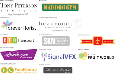
After spending nearly a week coming up with logos for these companies, this is the result:


I've deliberately kept these logos as simple as possible as the logos I like to believe should be as minimalistic but at the same time have something identifies who these companies are (I don't know how to really say these things, but I think simple things can sometimes work, especially if it's about corporate identity)

Product Assessment - Final Design 3 (DiSHBLASTOR Dishwashing Liquid)

Finally my last product design for this exercise (I think)...

Although I may have got a little carried away with the rough design stage, well anyway, here it is, my DiSHBLASTOR Industrial Grade Dishwashing Liquid Labelling:


Now I just gotta upload the Company Logos

Sunday, March 20, 2011

Product Assessment - Final Design 2 (PURE OWNAGE BISCUITS - SNAK ATTACK)

Finally completed the redesign of the second product. Here it is:


Product 2: Pure Ownage Biscuits SNAK-ATTACK


This one proved quite difficult to recreate from the rough sketches as the position of the biscuits proved to be difficult as the images of the biscuits looked like they are cardboard cutouts, so I had to compromise by putting the biscuits in a different position of the box, but otherwise, the core elements of the rough design (e.g. Typeface) was replicated in the final design

Product Assessment - Final Design 1 (uberMAX Extreme Roast Instant Coffee)

The first design for the redesigned products in finally complete, this is the final result for the uberMAX Extreme Roast Instant Coffee:


Product 1 - uberMAX Extreme Roast Instant Coffee


This is the result after days of painstaking work involved to redesign the product. I went with a Red/Grey Colour Scheme for the Background and for the main title fonts. Then I added the Coffee Cup, the Coffee Beans and the Guarana Beans, and then deliberately toned the images down to ensure that it somewhat blends in with the Background.

Overall I felt it almost replicates the rough design, with the only difference being the coffee cup being different in the final redesign compared to the rough design (mainly the positioning as trying to find a image similar to that in the rough design proved difficult - thus having to make some compromises).

Sunday, March 13, 2011

Product Assessment - Rough Designs

Since I've done the research on the products and commented on the strong and weak aspects of the labelling and package designs of all the products in question. I'm now at the stage of coming up with some rough designs for the redesigning of the products.

I've approached this by using the same purposes of these products, but under a whole new label/package design, new brand names/product names, different colours and so on and forth.

Here are my rough design in which it could work with the new products:


Product 1 - überMAX Extreme Roast Instant Coffee


I went with the name of überMAX as well as that concept, mainly on the grounds of that

a) I thought in my opinion it was a cool-sounding name

b) It was simply a random name that came to my mind

c) The Design of the Moccona Instant Coffee was simply in my opinion - boring!

So I decided that (with the fact that I way hyper from my morning coffee as I'm typing up this on my blog at the moment) I go along with this and came up with what you see in the above image.


Product 2 - Snak Attack Assorted Biscuits


This was a tricky one to come with, but fortunately with luck I did find an empty Arnott's Jatz Box, and whilst I couldn't really find any faults with the design of the Jatz Box (apart from the usual RDI Counter Information because nowadays as I'm starting to become rather health-wise), but changed it anyway, simply because I can.


Product 3 - DiSHBLASTOR Industrial Strength Dishwashing Cleaner


The dishwashing liquid in question I found felt too cheap (even including the print quality) and I felt it needed to change, the name DiSHBLASTOR, came about when I had the dreaded task of washing up the dishes last night and trying to scrub off those nasty tomato sauce marks (epic yuk!).

So I thought that I be a little ambitious for this one (and sometimes make something that could be unrealistic in real life - but imaginations are there for the reason - right?)

Well that is the gist of what I come up with so far.
Monday, March 7, 2011

Product Assessment - Research

Today, we have to find three products (with labelling of course) - this includes a Jar, a Box that can be folded and a Plastic Container explain about the good and bad aspects of its (the product graphics) design and create our own designs

Mind you this wasn't the easiest items to find given there wasn't really that much stuff in my house lately, but anyway here are my findings

Product 1 - Moccona Instant Coffee


Strong Aspects of Design:

- Simple - not too clustered
- Easy to Read (e.g. Fonts not to small)
- Promotes the brand itself

Weak Aspects of Design:

- The background colour is rather dull and doesn't really stand out that much


Product 2 - Coles Dishwashing Liquid


Strong Aspects of Design:

- Easy to Read (font isn't too small)
- Simple overall design, nothing too fancy involved

Weak Aspects of Design:

- Design Looks cheap (and the print quality even feels cheap)
- Looks like something that a little kid came up with


Product 3: Arnotts Jatz Original Biscuits


Strong Aspects of Design:

- Use of subtle yet bright colours
- Images show what the product should be like (in theory that is)
- Promotes the brand and biscuits with large fonts

Weak Aspects of Design:

- Nutritional Information is not at the front cover and that could be useful for anyone who is 'health-wise'

Sunday, March 6, 2011

Something completely random

Something off-topic, I was bored after completing all the work so far, so I thought of coming up with something easy and quick. Anyone heard of the meme "Shoop Da Whoop", well here is what I came up with:

Me, myself and I

Today, we had to come up with our own self-composite image that includes a background to work in as well as 10 Images of ourselves, here is the result:

Yet another composite

In addition to the Spot The Difference, we've had to come with another composite, something like this:


What we did here is took images of the Outdoor Foyer at Campus as well as some cars and bikes parked outside Campus and merged them together in Photoshop with the use of shadow techniques

Spot the Difference

A few weeks ago the Graphics Design Class were given the task to compare two images and spot the differences in the images, the images are on www.gdidm.com/luke and the differences between the first photo and the second photo were the following:

- The Guitar
- The Sink
- Toy Car
- Vase
- Colour of Plastic Bags
- Fire Extinguisher
- Location of Power Outlets
- Door to the Theory Room
- Fire Hose Reel Sign (says 'Feel')
- Writing on the Fire Reel Door
- Chairs in the Lobby (the Colour)
- Golf Ball in the Photo
- Fire Hose Reel Door (different colours)
- Cadbury Chocolate Bar in the Second Photo
- The Cup on the Kitchen Bench
- Door Handle on the Kitchen Cupboard
- The Fountain ('Wall Fountain' in the First Photo and 'Fun Fountain' in the Second Photo)
- The Access Panel of the Fountain is different in both photos

So after having a crack at the 'Spot the Difference', this is the composite that I've come up with:


As you can see with the photo above, that is my effort on the spot the difference