
Sunday, November 27, 2011
Timeline
Last week of TAFE for the year and I need to post some of the things that we did for the assessment. In this case, here is my 'future' timeline

Tuesday, November 8, 2011
Pieces of Work to put for my exhibition
Matt Drake here,
It's near the time for exhibition and with that comes at the time that I need to display some of my best works, here is some of the pieces of work that I'll be displaying:
My A3 Poster (my 'future' poster):

The Zing Nightclub Stationery (A3 Poster, A4 Letterhead, Business Card Front and Back and With Complements Slip


CD Cover Project


Kidsons Cycles Logo Drafts


Company Logos

It's near the time for exhibition and with that comes at the time that I need to display some of my best works, here is some of the pieces of work that I'll be displaying:
My A3 Poster (my 'future' poster):

The Zing Nightclub Stationery (A3 Poster, A4 Letterhead, Business Card Front and Back and With Complements Slip


CD Cover Project


Kidsons Cycles Logo Drafts

Tuesday, October 25, 2011
Video Tutorials
For my tutorial I need to create. I have made my intention in attempting to create a HDR panorama both with the use 'Merge to HDR Pro', Photomerge and Content Aware Fill. Unless that changes, I felt that I'm going with that as Panoramas are essentially new to me and that will also teach me a few things, in addition to teaching others (well...trying to)
I'm yet to decide on where to do the photos for the panorama tutorial, but will decide on that by Next Monday time. As for the software, I'll be using the software that came with the Mac (which was somewhat a surprise as the version of QuickTime Player that is one the Mac has screen recording capabilities).
I'll keep posting as the weeks progress
UPDATE (31/10/2011): I have started to find some examples of tutorials on HDR Panoramas, in which should allow me to create a tutorial like these, but adding my own spin.
HDR Pro and Panorama through Photomerge
Creating Panoramas Manually
Merge to HDR Pro (Parts 1 & 2)
Tuesday, October 11, 2011
Design Brief
My apologies for not posting this earlier, I had things to do during the holidays in which making posts was not possible. But anyway:
I was given a design brief by Tristan Boersma to create some business designs for a fictional comic book shop called 'Stan's Comic Corner', in which I had to create the following:
- A Logo with Slogan
- A Point Of Sale (POS) 3D Promotional Product
- Website Mockup
- Shopfront Mockup
- Brochure of Business (A4 to DL Brochure) OR 4 Page Booklet (in A5) OR A2 Poster
In the first consultation meeting, I had came up with some concepts, as shown below:


In the first consultation meeting, we decided to go on with the yellow logo in the top right of the first set of logos. The summary of the meeting was as follows:
- The use of a borderless logo
- Avoid the use of Blues
- Decided on the Red Text with Yellow Background
- Slogan needs to be orientated with comics
- Eliminate the 'Wagga Wagga' Sub-Heading
In the second consultation I received feedback on the works that was to be done and fix up a few things, here is the feedback I've received on the work in progress:


I continued on the work, as well as fixing up the odd issues on the existing stuff based on the feedback and produced the following final works during the holidays:
Stan's Comic Corner Logo and Slogan (both in Full Colour and Black & White)

A5 Booklet - Front Cover (Page 1) and Back Cover (Page 4)

A5 Booklet - Inside of Booklet (Pages 2 & Page 3)

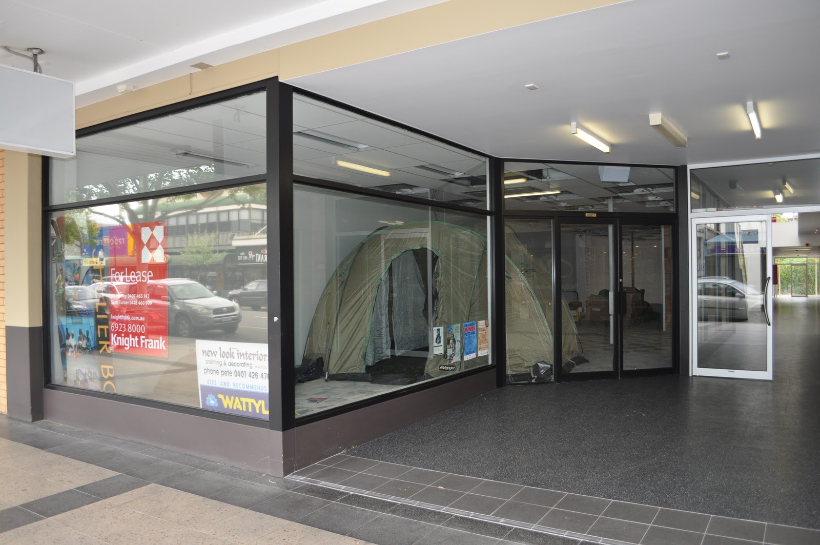
Shopfront
Original Photograph taken from my Nikon D5000 SLR (image of the empty shopfront on Baylis Street in Wagga Wagga, where Fletcher's Photographics used to be)

Shopfront Mockup of Stan's Comic Corner

Website Mockup
Newspage

Comics Search and Listing

About Us

3D Point Of Sales Product

Overall, I was rather satisfied with the work I've produced and I felt that I've met all of the requirements of the design brief that was given to me.
I was given a design brief by Tristan Boersma to create some business designs for a fictional comic book shop called 'Stan's Comic Corner', in which I had to create the following:
- A Logo with Slogan
- A Point Of Sale (POS) 3D Promotional Product
- Website Mockup
- Shopfront Mockup
- Brochure of Business (A4 to DL Brochure) OR 4 Page Booklet (in A5) OR A2 Poster
In the first consultation meeting, I had came up with some concepts, as shown below:


In the first consultation meeting, we decided to go on with the yellow logo in the top right of the first set of logos. The summary of the meeting was as follows:
- The use of a borderless logo
- Avoid the use of Blues
- Decided on the Red Text with Yellow Background
- Slogan needs to be orientated with comics
- Eliminate the 'Wagga Wagga' Sub-Heading
In the second consultation I received feedback on the works that was to be done and fix up a few things, here is the feedback I've received on the work in progress:


I continued on the work, as well as fixing up the odd issues on the existing stuff based on the feedback and produced the following final works during the holidays:
Stan's Comic Corner Logo and Slogan (both in Full Colour and Black & White)

A5 Booklet - Front Cover (Page 1) and Back Cover (Page 4)

A5 Booklet - Inside of Booklet (Pages 2 & Page 3)

Shopfront
Original Photograph taken from my Nikon D5000 SLR (image of the empty shopfront on Baylis Street in Wagga Wagga, where Fletcher's Photographics used to be)
Shopfront Mockup of Stan's Comic Corner

Website Mockup
Newspage

Comics Search and Listing

About Us

3D Point Of Sales Product

Overall, I was rather satisfied with the work I've produced and I felt that I've met all of the requirements of the design brief that was given to me.
Tuesday, September 27, 2011
Stationery Logo Drafts
I was meant to post this earlier, but because my interwebs was down and I had important matters to attend to, that was not possible. But anyway, I got some drafts for the stationery logos, as shown below:


Wednesday, September 21, 2011
Kidsons Cycles - Employment Obligations and Resposibilities
Well as I post this, we've finished for this Term.
I'll start by saying this was a rather interesting term, having both highs and lows and rather some interesting times that happened the last term.
Anyway enough of the reminiscing, what I'm here to post is about what I had to do throughout the duration of the Kidsosns Cycles Rebranding Project.
My responsibilities for the project was Print Researcher as well as writing the Style Guide. Part of my responsibilities as print research was determining specific print requirements for things such as business cards, colour specifications, jerseys, etc. During the time of the project, I had to contact Clothing Company 'Cannibal Clothing' who (based up in Tweed Heads) make the thousands of jerseys available for cycling shops (this including Kidsons Cycles) and were more than happy to help with my enquiries and provided me the templates available.
The second part of my role throughout the project was the creation of the style guide, which interestingly, turned out that Kidsons Cycles never had a pre-existing style guide available - meaning that I had the 'fun' part of creating one from scratch, although I had to wait for my classmates to finish the Business Cards and Letterheads before defining the style guide throughly. In addition, I had to define the colours used with the new logo and associated stationery.
Apart from that, my role in the project went somewhat smoothly, although the thing that I can improve on you be more consultation with classmates when setting out standards in relation to the style guide.
Monday, September 19, 2011
More Logos, Stationery and other things
Drakie here,
Today we were given some business names from our classmates (in my case, mine is from Katelyn), for each we come up with logos for. These are the following logos:
- Markham's Construction (the boring one)
- Divine Hair and Beauty (the so-so one)
- Zing Nightclub (the awesome one)
For each of the logos, we have to come up with the following:
- Business Card (AS 90mm x 55mm)
- A4 Letterhead
- With Complements Card
In addition, we have to come with one of the following for each business:
- A3 Poster
- A5 Flyer
- Swing-Tag
- 3D Point Of Sale Item
- Fridge Magnet
- Bookmark
All of this being due 25th October 2011
Sunday, September 18, 2011
Rapid Logo Study 3 - Final Logo
Drakie here,
Today, we had to create our Final Rapid Logo Design 'Trident Grill', to my surprise, my logo design was the winning one (I've done something right here), as shown below:

I kept mine as minimalistic as possible (by only having the text and the 'trident') whilst trying to keep the logo functional, but apart from that. I can't think of anything else to mention.
Sunday, September 11, 2011
Business Stationery Critique - 12/09/2011
Drakie here,
I was critiqued with the stationery for three businesses, the only issues were:
- Make the Address Information 'Right-Aligned' when positioning the text on the right
- The need to maintain a 10mm spacing between the logo/text and the edge of the paper/card
- Spacing between the logo and text
Apart from those minor issues, nothing too disastrous.
Tuesday, September 6, 2011
Rapid Logo Study 2 - Something went horribly wrong here...
The second logo we had to do for the Wednesday Rapid Logo Design 'Pip-Squeaks Kids Play Centre, and clearly something went wrong here with my logo here:

The result was 19/45 (Oh dear...) But nevertheless, there is always room for improvement with the next logo next week.
This is the winning logo for this week, this one by Tania Filocamo:


The result was 19/45 (Oh dear...) But nevertheless, there is always room for improvement with the next logo next week.
This is the winning logo for this week, this one by Tania Filocamo:

Monday, September 5, 2011
Class Task - Creating Business Stationery
First post for September
We have to create some stationery for some 'fictional' businesses. Each business needed to have an A4 Letterhead, a Business Card (Australian Standard 90mm x 55mm) and a With Complement Card. Here are the results so far
Business 1: Smith & Jones Lawyers

A4 Letterhead

Business Card (90mm x 55mm)

With Complements Slip
Business 2: Mango Creative

A4 Letterhead

Business Card (90mm x 55mm)

With Complements Slip
Business 3: Hoot Kidswear

A4 Letterhead

Business Card (90mm x 55mm)

With Complements Slip
More will be posted once completed
We have to create some stationery for some 'fictional' businesses. Each business needed to have an A4 Letterhead, a Business Card (Australian Standard 90mm x 55mm) and a With Complement Card. Here are the results so far
Business 1: Smith & Jones Lawyers

Business Card (90mm x 55mm)

With Complements Slip
Business 2: Mango Creative

A4 Letterhead
Business Card (90mm x 55mm)

With Complements Slip
Business 3: Hoot Kidswear

A4 Letterhead
Business Card (90mm x 55mm)

With Complements Slip
More will be posted once completed
Sunday, August 28, 2011
Logo Design for Kidsons Cycles (Final Works)
I am now satisfied with the final logo design for Kidsons Cycles, the final logo design is based on what I've personally liked, as well as experimentation as well as feedback from various people, but as I upload the image of my final work, I'll be explaining in how I came about the concept.
Do bear with me as I'm not so good with explaining concepts, but here it goes:
Here is the final logo designs (click on image for better detail):

But before I explain on the whole colour schemes, typeface, etc. The Research section mentions in how I went on with the overall design process of the logos
RESEARCH:
I went for that particular design as after some research with regards to Cycling Shops and the Cycling Scene in general, I found that minimal logo design works best for this particular business (particularly with Image 3 as you will see below), here are some examples that I've found to prove that point:

Image 1: Dash Bike Shop (http://www.dashbicycle.com)

Image 2: Rock N' Road Cyclery (http://www.rocknroadcyclery.net/index.php)

Image 3: Fanatik Bike Co. (http://fanatikbike.com/)
Based on the research on the client's competitor's logos, I got inspiration from the sprocket in the first logo as well the typeface in the second logo and the colour scheme (what looks like a 'Banana' Yellow - I think) in the third logo.
DESIGN:
I went with a design that with minimalism and function at mind (as shown with the three logos that I've came across). So I've picked out elements out of the three logos and decided to go with that.
In addition, I wanted to modernise the Kidsons Cycles as the existing one, felt a bit 90's at best. So I decided to change the font a bit, I initially went the Myriad Pro font, but it was criticised for being 'too business like', then I came across a font called 'Motschcc' (I don't know why it's called that), I went with that font because it was I felt both Modern and 'Technical', and that's something I felt it could work well with a cycling shop logo.
COLOUR CHOICE:
As for the colour design for the custom colour in the final design Kidsons Cycles Logo, in addition to one with the client colours (the orange and the dark blue), I initially had two colour schemes:
The first one was with kind of a 'banana' yellow with a dark shade of grey, or something similar to that from the Fanatik Bike Co Logo as it was for the purpose of logo design, energetic and attention-seeking (more information on that can be found at http://www.logocritiques.com/resources/color_psychology_in_logo_design/).
The second colour, the light shade of green with, again with a dark shade of grey.
The green is often regarded as a refreshing colour and easy on the eye, this is based on reference from the following websites:
- http://www.cottagehomedecorating.com/green-color-scheme.html
- http://www.infoplease.com/spot/colors1.html
In addition, I've also got some inspiration of the green colour from that from the 'Monster Energy' Caffeine Drinks, as shown below:

(unrelated to the whole cycling industry, but something that was worth mentioning - the company's site can be access by clicking here)
I considered the client colours inappropriate for the logo design as the current colour scheme as over the place (whilst I felt the orange can work, as though less intense, the orange is a strong and commanding colour nevertheless but the blue I feel is rather too dark and somewhat cold, as mentioned here).
A common element with the custom colour schemes in the logo design is the grey, I went with the grey as it is regarded as a neutral colour and is often paired with other colours (The information on the grey in logo design was found on this website - http://www.logocritiques.com/resources/color_psychology_in_logo_design/)
For the final logo design with the custom colour, based on my personal views as well as feedback from various people, I went with the green/grey colour scheme.
Do bear with me as I'm not so good with explaining concepts, but here it goes:
Here is the final logo designs (click on image for better detail):
But before I explain on the whole colour schemes, typeface, etc. The Research section mentions in how I went on with the overall design process of the logos
RESEARCH:
I went for that particular design as after some research with regards to Cycling Shops and the Cycling Scene in general, I found that minimal logo design works best for this particular business (particularly with Image 3 as you will see below), here are some examples that I've found to prove that point:
Image 1: Dash Bike Shop (http://www.dashbicycle.com)
Image 2: Rock N' Road Cyclery (http://www.rocknroadcyclery.net/index.php)
Image 3: Fanatik Bike Co. (http://fanatikbike.com/)
Based on the research on the client's competitor's logos, I got inspiration from the sprocket in the first logo as well the typeface in the second logo and the colour scheme (what looks like a 'Banana' Yellow - I think) in the third logo.
DESIGN:
I went with a design that with minimalism and function at mind (as shown with the three logos that I've came across). So I've picked out elements out of the three logos and decided to go with that.
In addition, I wanted to modernise the Kidsons Cycles as the existing one, felt a bit 90's at best. So I decided to change the font a bit, I initially went the Myriad Pro font, but it was criticised for being 'too business like', then I came across a font called 'Motschcc' (I don't know why it's called that), I went with that font because it was I felt both Modern and 'Technical', and that's something I felt it could work well with a cycling shop logo.
COLOUR CHOICE:
As for the colour design for the custom colour in the final design Kidsons Cycles Logo, in addition to one with the client colours (the orange and the dark blue), I initially had two colour schemes:
The first one was with kind of a 'banana' yellow with a dark shade of grey, or something similar to that from the Fanatik Bike Co Logo as it was for the purpose of logo design, energetic and attention-seeking (more information on that can be found at http://www.logocritiques.com/resources/color_psychology_in_logo_design/).
The second colour, the light shade of green with, again with a dark shade of grey.
The green is often regarded as a refreshing colour and easy on the eye, this is based on reference from the following websites:
- http://www.cottagehomedecorating.com/green-color-scheme.html
- http://www.infoplease.com/spot/colors1.html
In addition, I've also got some inspiration of the green colour from that from the 'Monster Energy' Caffeine Drinks, as shown below:
(unrelated to the whole cycling industry, but something that was worth mentioning - the company's site can be access by clicking here)
I considered the client colours inappropriate for the logo design as the current colour scheme as over the place (whilst I felt the orange can work, as though less intense, the orange is a strong and commanding colour nevertheless but the blue I feel is rather too dark and somewhat cold, as mentioned here).
A common element with the custom colour schemes in the logo design is the grey, I went with the grey as it is regarded as a neutral colour and is often paired with other colours (The information on the grey in logo design was found on this website - http://www.logocritiques.com/resources/color_psychology_in_logo_design/)
For the final logo design with the custom colour, based on my personal views as well as feedback from various people, I went with the green/grey colour scheme.
Subscribe to:
Posts (Atom)